Friday, 17 January 2014

Ngee Ann Poly Open House

On 10th Jan, we headed to Ngee Ann Poly to look at their open house and how they organised it.
As we stepped inside their school, there were many friendly guides to assist us. We then headed to complete the tasks that we were asked to complete.
First, we headed to their media school as it is easy for us to compare because we're studying the same course. Below are some of the banners and standees around the school.
The theme of the school is"Always that something xtra". It can be seen all around the school and it is easy to remember because it is simple.


We also took photos of their stage. The stage is actually like a booth where they play music and MC there.


Before we went to all the different places, we went to take their goodie bag! The goodie bag has quite a lot of things and the design of their bag is simple and they also emphasise on their key msg. The colours  used are white, red, yellow and purple, which are constantly used for their brochures and bags and even their banners.


Their brochures
We were also asked to take a look at their T-shirt designs. Unfortunately, we didn't manage to take photos of other courses' T-shirts, but we do know that different courses have different T-shirt designs, with different colour representing them. For their media course, they are known as "FMS Agents".

We also took a tour around their media school and they actually explained their things really well despite us laughing because we weren't supposed to be there :P They have their own magazines which are written by their students and I think it's really cool because the students are able to express their creativity through these mediums.


And this is how their website looks like!


I love the design of their website because they're so visual and easy to navigate. Also, the design is unique and simple!

Overall, I think that their open house was effective because of the people as well as the designs of their work are creative and amazing. The colours used were vibrant and it makes people feel happy looking at them. To improve, they could have worked on improving their brochures and make it less wordy. Usually people don't really like to take brochures and if it is very wordy, it will be a turn off to people.
As a whole, I think they did well !!^^

Thursday, 16 January 2014

Orchard Road Trip

We went to Orchard Road for our field trip and we were asked to answer some of the questions that were given. Upon reaching, we were asked to analyse the brand's logos and art direction. The different brands that we took pictures of have their brand name as their logo. The art directions are pretty straightforward and exquisite. The lighting and typography creates an elegant feel which relates to why they are the luxurious brands.

 Giorgio Armani
 Prada
 Dior
 Dolce&Gabbana
Louis Vuitton
The similarities between the brands are that their logos are mostly in caps and of the same colour. The differences however, are that their target audience are different and therefore distribution and production differs.

We were asked to compare the 2 brands and the similarities are that their typography are in caps and white fonts. The colour of their shop are mostly black and white. However, their target audience are different. DKNY targets those who just started working and LV targets rich statuses. 


We also went to Wisma Atria and we were asked to compare the advertisements on the escalators.
The first one is simple and straightforward. It allows people to look at it when they're going down the escalator and because it is big, it captures more attention. The second one on the other hand is small and makes it unable to know what it is selling. However, the repetition of the ads makes it a plus point because it captures consumer's attention and the colour of the ads are bright.


At Taka, we were asked to compare the different food stalls logos. Most of them have cute pictures as their mascot and it makes it more visual and nice to look at. Also, most of their colours they use are red, black and white. The cartoons are a representation of what they're selling.


We also headed down to Mandarin Gallery to take a look at the "Dolls project". As part of it's 10th anniversary celebrations, the store collaborated with 10 international fashion designers to produce products that were intricately crafted and the dolls were miniature versions of their signature concepts.


I think that the designs of the costumes are very unique and stylish! However i think that they could have placed the clothes on display and not put them on the dolls because they're a little scary and people might not even want to take a look at them if they're afraid of dolls. Overall, I think that the field trip was alright, but we could have learnt more if there were more interesting things.

Wednesday, 9 October 2013

VC critique 3


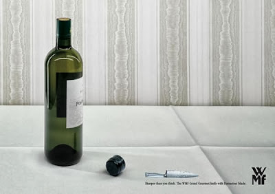
I feel that this ad is too exaggerating because a normal knife will not be able to be that sharp to cut the whole chopping board. This makes people unable to believe in the product. Although it is good that the person tries to make things more fun and creative, I feel that it's really unbelievable. Furthermore if one were to think deeper into it, it might actually appeal to people who might buy the knife to hurt others. I don't think that anyone in the right state of mind will buy the knife after seeing the ad. Too much doubts about the product and which makes it a bit of a cheat as well.


Here are other ads for the same company and most of their ads are all really exaggerated. It might be the designer's idea to make everything dramatic which is a plus point because the ideas are creative and bold, however I'll definitely have my doubts in buying the product.

Saturday, 21 September 2013

VC critique 2


This is a print ad for Magnum ice cream and this ad uses sex appeal because if one sees closely, the 2 ice cream in front is actually shaped like a butt and when one sees the whole picture, it's actually like a woman standing up in a sexy pose. I think it is really creative although most ice cream ads seems to associate themselves with sex appeal but I find that it is different from others because other ads tend to use real woman to attract people to buy it but this uses a different approach. Also, some people might not be able to tell the meaning to the ad at first look, this allows people to think as well. Although this is a creative ad, I feel that it's not very good for young children to look at because of the hidden meaning behind it. Also, even if one were to look at it without thinking of the hidden meaning, it doesn't appeal to people because it's quite plain and dull. I think that there can be more room for improvement though!(:

Sunday, 15 September 2013

VC critique 1


This is a print ad for mercedes benz and I think it's pretty creative because the person in the picture actually has "2 faces" which creates an illusion.
The guy is actually facing the front but his eyes are facing the side, which shows that one can actually look straight without having to turn their head to the side to check for other vehicles.
Also, according to the text written on the side, the writer uses pun by saying "look to the side without looking to the side."
The first time I look at the print ad, it actually captured my attention because of the person's face and after reading the words, I feel that I actually understand what the person is trying to say and I think this is a pretty good ad because it is creative and also makes people think.
This will attract car buyers to want to buy the car because one does not have to keep turning their heads to look at oncoming vehicles.
Of course ads tend to be exaggerative and one should just take it with a pinch of salt!

Thursday, 8 August 2013

VC day 11

Lately, we have been working on our upcoming CA and here are some photos during the whole process.


This was actually my 1st design but the colours were more colourful and vibrant but I felt that it wasn't very nice and I din't want this design to begin with but the lecturer told me to show him one of my design so I didn't think much and showed him this.


I decided to change my design because i thought it was better to change to something more simple and people will be able to understand and chose pictures that had link to business.
However, my lecturer told me I can't just change the design just because I feel like it and I felt that what he said was true.
So I decided to stick to my original one and changed the colours and improve on it because my lecturer told me the colours I used were inappropriate.
I just hope that the end product will turn out well and that I can do well for this to pull up my grade.

Tuesday, 23 July 2013

VC day 10

We have been doing research and sketches for our upcoming CA,
which is to do a corporate brochure.
Now that we are more familiar with InDesign, it's easier for us to do it and lesser mistakes were made as we were doing it.

Here are some examples of what we did today:
I felt that my brochure wasn't good enough because it doesn't looks good but turns out the lecturer was fine with it!
I had to touch up on some of the things though!
Some covers that we were told to do.

Oh and we got back our previous CA today.
Just passed but I actually expected it because I know I didn't put in much effort to complete the work.
But no one told me that there were things I wasn't supposed to do so I felt kind of upset about it.
But it's ok!
I told myself I'll work hard for the brochure CA and get an A to pull my grade up (: